Last Updated on October 30, 2024 by Owen McGab Enaohwo

If Pipefy alternatives are what you’re looking for, then you’ve probably tried Pipefy already, and want something that does not have its many issues. Incidentally, SweetProcess happens to excel at all or most of those aspects of Pipefy.
Pipefy says that their software, “optimizes your business processes one workflow at a time.” Which, frankly, is how it is with every other software unless you have several teams working on and synchronizing several workflows all at the same time.
The following, apparently, is what sets Pipefy apart:
Built for fast deployment, Pipefy users can easily customize and design complex processes in a matter of minutes, not months. It offers hundreds of pre-built workflow templates that users can instantly customize and start running.
Sounds good. But some reviewers say that the setup itself takes up too much time, and that automated rules and conditionals that need to be relinked every time a user makes a change causes more delays in adjustments.
However, it is difficult to assess any software properly without prolonged use. To be able to write a balanced and authentic article, we have combined user reviews and our own experience with Pipefy (as well as its alternatives).
Meanwhile, if you’d like to give SweetProcess a try, we have a no credit card required, 14-day trial with regular email communication that helps you make the most of the trial. Please feel free to see for yourself.
TABLE OF CONTENTS
Chapter 1: Common Complaints Against Pipefy
Chapter 2: Pipefy Alternatives
- 2.1. SweetProcess
- 2.2. iAuditor
- 2.3. Coassemble
- 2.4. Process Bliss
- 2.5. Scribe
- 2.6. Trainual
- 2.7. Way We Do
Chapter 3: Summing It Up: Have You Decided on Your Pipefy Alternative Yet?
Chapter 1: Common Complaints Against Pipefy

Pipefy looks pretty. But it has certain problems beyond its steep learning curve.
To be fair, there are tutorials for everything. Still, wouldn’t you prefer an intuitive interface instead? Let’s begin with the pipe in Pipefy.
1.1. Pipes
Let’s see what happens when you are doing something fairly basic such as creating your first pipe. A “pipe” is Pipefy’s name for a process, by the way.
This is your homepage view in Pipefy as you log in to your account:
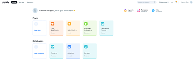
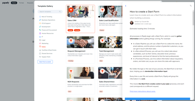
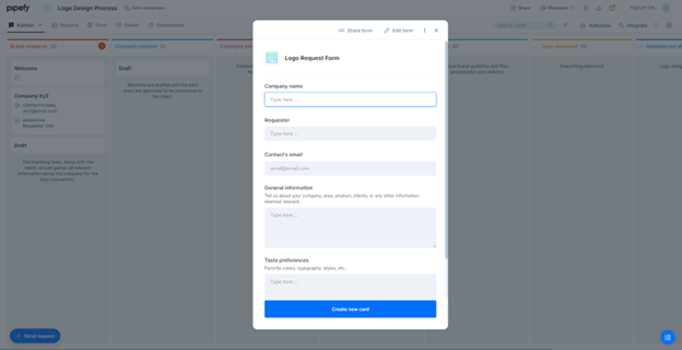
To create the pipe named Logo Design Process, we used the template library. You can also start from scratch.
As you can see, the help topics stay pinned to the right if you want them to. This is certainly helpful.
And then you have created a new pipe called Logo Design Process:
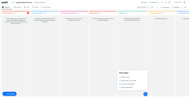
We used a 23.5-inch desktop monitor, viewing the page at 100 percent without using the Zoom Out feature in our browser. As you can see, the columns (which are phases in your process) are running to the right of the screen and beyond. This is Pipefy’s own template, and we’ll assume it inserts logical phases into a process. So, logically, you’d be expected to scroll horizontally whenever you are viewing a process. A touch-screen monitor seems to be a prerequisite here.
Now you have to insert cards by clicking the white plus sign in the red circle top right of the first column (on the left).
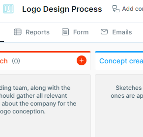
Cards contain all the data about a certain stage of the process or about a person or the company you are working with—about anything, really.
About moving the cards out of their origin phase: We expected a simple drag or swipe to get the job done. Unfortunately, the phases started displaying the following message in unison: “You can’t move this card to this phase.”
Turns out, the only way you can move a card into a different phase is from within the card settings.
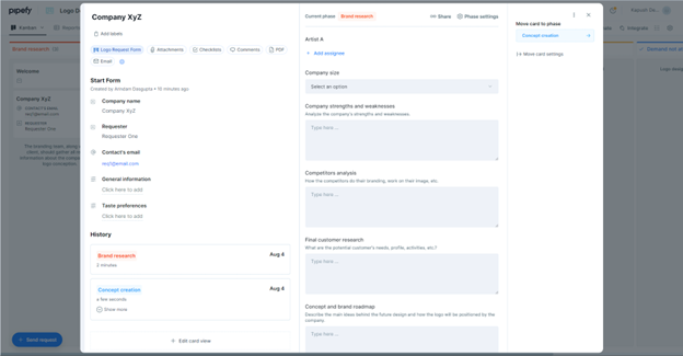
Yes, the “Move card to phase” option, top right:

Sure, this failsafe stops the cards from being accidentally moved out of where they are supposed to be. But a simple pop-up that asks you to confirm whether you want the card moved might have made things a tad easier. And it would be best if we could turn off the pop-up if desired.
1.2. Learning Curve
Users struggle with the high-learning curve when it comes to onboarding new members.
We are used to an intuitive interface on SweetProcess. If you go through the SweetProcess section carefully, you’ll notice, for example, that you simply can’t miss the navigation menu. The items on the menu are literally the names of what you most commonly need on a daily basis (such as procedure, document, process, and so on).
On Pipefy, it seems all about watching tutorials and then trying to implement them. This is a vital difference when you are adding new members to your team or even when you are attempting to use the software for the first time. After all, time does mean money. We have tried to explain this learning curve issue with a bit more clarity in the Pipefy Alternatives section when talking about SweetProcess.
1.3. Customization
There are plenty of customization options but not invariably the ones you’d expect—or want. We discussed the problem with customizing and dragging cards in the Pipes subsection earlier. In this section, we’ll explore the visual appearance of Pipefy. This aspect is particularly important for anyone who prefers to work in a personalized environment.
The most obvious problem is that you cannot customize the aesthetics. We could find no option to that effect, and then we learned from looking at user reviews that you have to work with what they’ve given you.
But why would you want to customize the colors to begin with? For two main reasons, we’re guessing.
First, if someone feels good about the interface, they may want to feel even better—as in making slight changes to the tones to create the perfect workplace for themselves. That, in turn, should increase their productivity.
For the same category of users, depending upon where they click, the Accounts view may look garish.
Or, it could look bland.
After the pleasant ambience of the default Kanban view in the project home page, either of the two could be disappointing even for people without a keen sense of aesthetics.
If Pipefy’s objective is to provide an aesthetically pleasing workspace (otherwise, why bother with colors and design), forcing the user into an inconsistent or even distressing environment randomly is probably not the best approach.
And second, not everyone likes such a colorful space to begin with, especially when they have no control over it.
1.4. Search Function
We tried a basic search and it failed. Yes, there must be some perfectly rational explanation, but for something as basic as a search function, we absolutely refuse to read a tutorial or contact support.
Let us show you how it went.
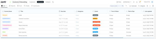
This is the Customer Onboarding default template view. You can see the phases with their respective cards. You will notice a “Search cards” field at the top right.
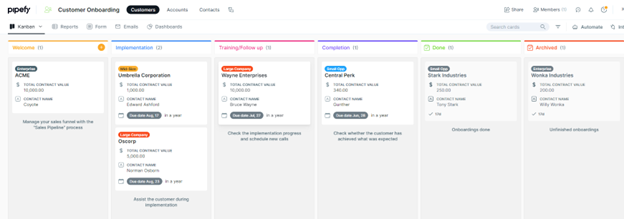
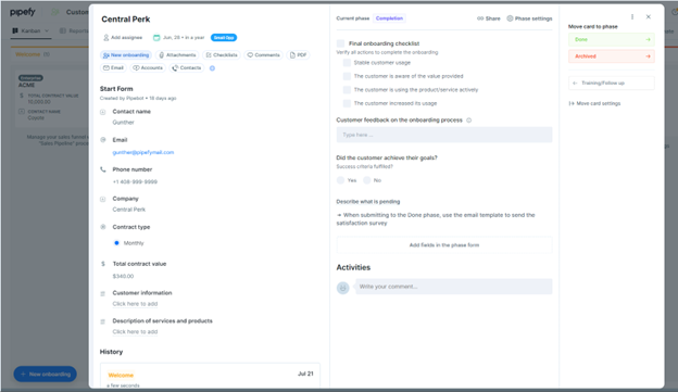
We clicked on the “Central Perk” card in the Completion phase. The card popped up in full view. Please note the “Total contract value” ($340.00): sixth item from the top, left column.
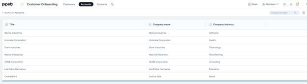
We decided to type in “$340.00” in the search field.
In other words, we inserted a value from within a card in the “Search cards” field.
This was the result our search returned:
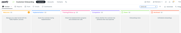
No offense to Pipefy or its satisfied customers, but we were left wondering what would happen after a few dozen projects and their individual cards accumulate. One reviewer answered that question for us, complaining that their UX was terrible and they couldn’t manage more than 50 cards.
At some point, while writing the text above, we were logged out. Getting logged out after such a brief period of inactivity usually happens with banking sites. Thankfully, we found ourselves back to the last view once we logged in again.
1.5. Support
Clients struggled with the chat interaction, claiming that Pipefy support often left them hanging and couldn’t resolve simple problems or restore functions to simple processes.
Chapter 2: Pipefy Alternatives

We compiled a brief list of Pipefy alternatives because we figured it’d help you best if someone narrowed things down for you. While creating our list, we considered both functionality and user experience.
We tested everything instead of going only by reviews (just as we tested Pipefy itself). An illustrated summary of our experience is what we are offering in each case.
Please bear in mind, however, that certain issues only crop up after you’ve used a software for a while. Although we did test every option as stated, the only one we can vouch for is our own.
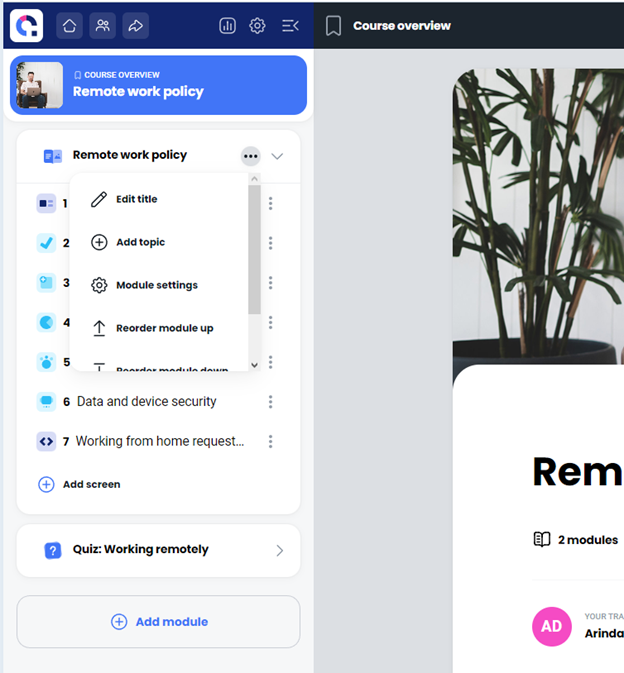
2.1. SweetProcess
The SweetProcess motto is:
Focus on the work that matters.
Document processes, procedures and tasks in one place so you can stay focused on growing your business.
And its USP (unique sales proposition or, what is really special about what SweetProcess offers) is simplicity—in every respect.
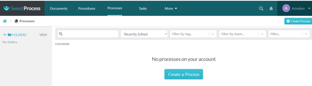
This is your basic navigation once you log in. It has everything you need without any distractions.
You want to create a process? A procedure? A task? And have the option to view everything in one place? Well, click on Process, or on Procedure, or on Task, and then view everything under Documents. Simple. Intuitive. Effective. And with practically zero learning curve.
Believe it or not, we have actually told you everything about SweetProcess in that last paragraph. But let’s illustrate what we mean for further clarity.
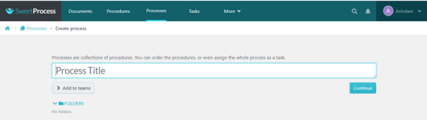
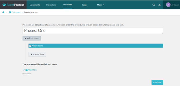
Creating a Process and Procedure with SweetProcess
This is as easy as:
Step 1:
Step 2:
Step 3:
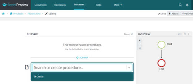
Sure, there are other steps involved where you actually create the procedures for the process.
Here’s a summary of what happens next:
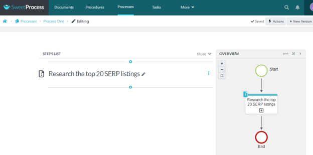
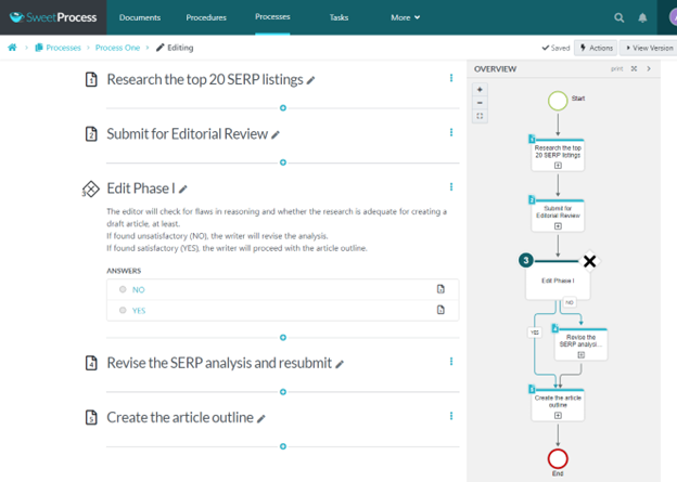
See that gray box bottom right with white and red circles? That’s a process map that updates itself real-time as you create the next steps (or procedures) for your process. Let us show you how it works.
If you have existing procedures, they will appear as drop-downs when you click the text box. Keep an eye on that gray box as you create or select a new step/procedure (and press Enter/Return on your computer keyboard).
Voila!
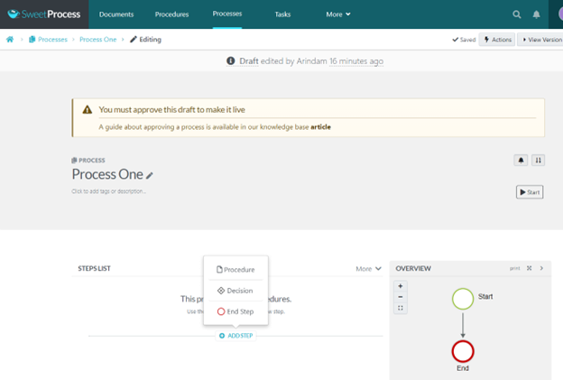
Now that the process map has updated itself, let’s play with the Decision option in the steps menu after we have created at least two more steps.
Then click on “Finished Editing” in the Decision text box:
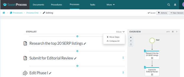
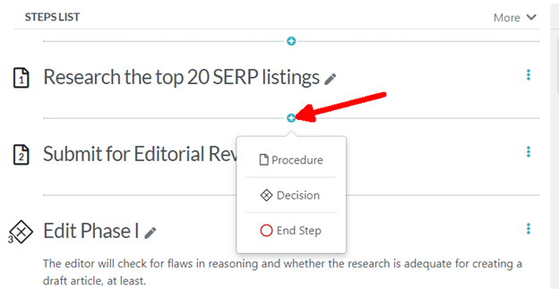
Just so we are clear, you can move, rename, or delete any of the steps by clicking on the “More” option to the right of the “Steps List” heading where the steps begin, by clicking the three dots beside every step, or by clicking on the edit icon. Here are two images showing you the “More” option route.
More > Move Steps:
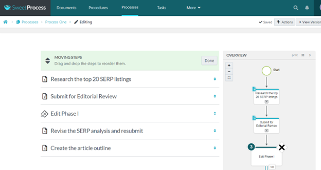
And the “MOVING STEPS” option presents itself which is a drag-and-drop feature.
So far so good, but what is this about setting up a “Step Lane” (marked in red below)?
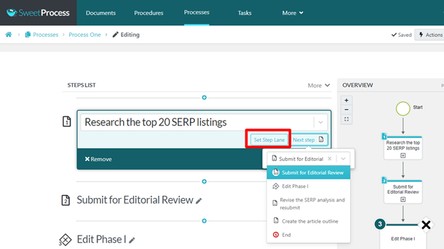
The Step Lane is something we are still working on. We continue to add new features and improve the software, and if you sign up, maybe you’ll find out for yourself how this could make your life a whole lot simpler.
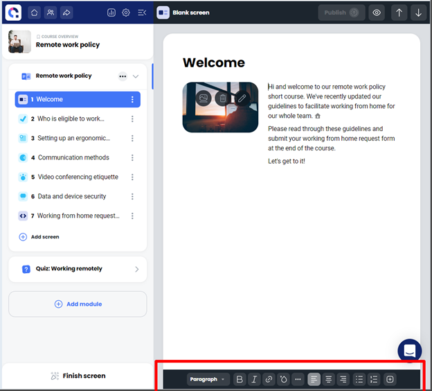
How Detailed Can You Get With SweetProcess?
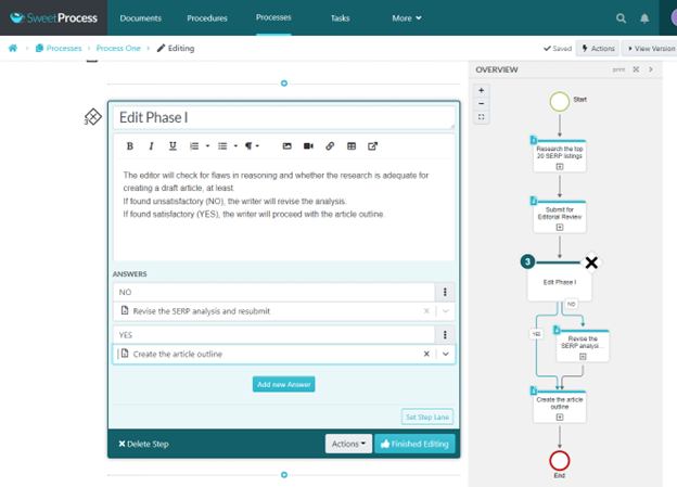
Let’s take one of the steps/procedures we just created.
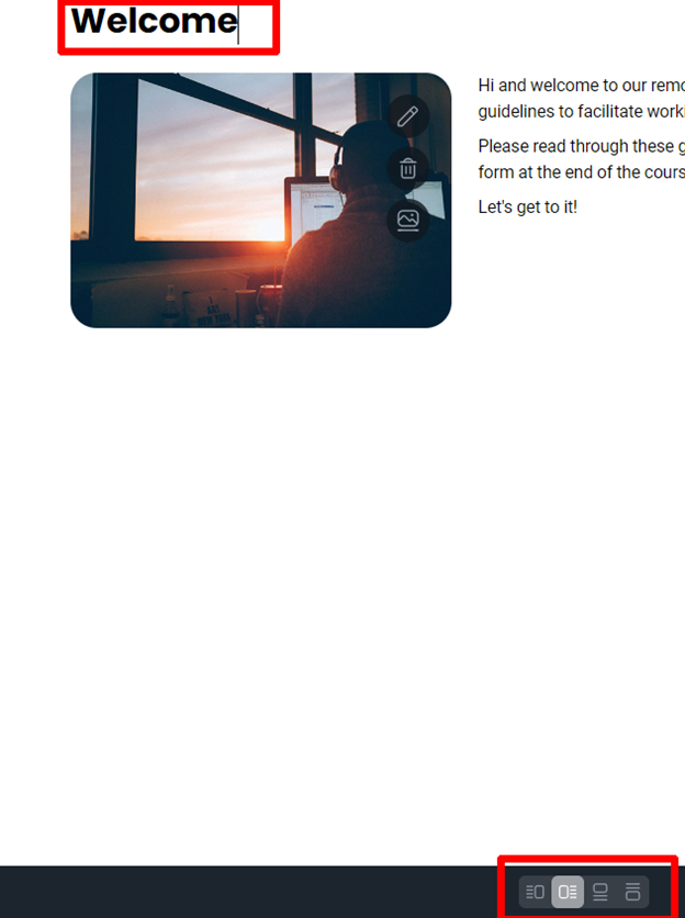
Ideally, this would contain all the steps, in as much detail as you require, so that anyone who is following this particular procedure knows exactly how it should be done. We named the step to show you how a process is created. To add content now, click the blue “Edit” button top right.
This will make the pen (or Edit) icon visible next to it. Note also the other options that have appeared just below the main nav bar.
Once you start editing (after having clicked the pen icon), you are presented with the option to add images, links, and videos. There’s also an option to embed video (from external sites like YouTube) on the bottom left.
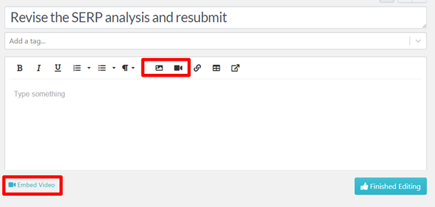
You can create a bare-bones text instructions document or a full-featured, media-rich presentation of sorts depending upon what you think will best serve your purpose.
Creating a Policy With SweetProcess
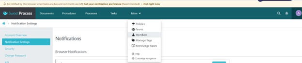
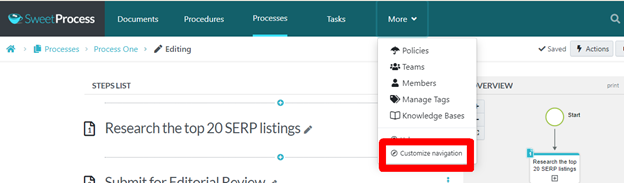
This should be a no-brainer, especially after all we’ve already shown you. From the “More” tab, click on the “Policies” tab, then “Create New Policy.” Next name the policy and populate the details in the text area; , click “Approve” or, if you don’t have the authority, click on “Request Approval.”
You will have the option to assign the policy to a team or multiple teams. But did you notice how we got to the “Policies” tab?

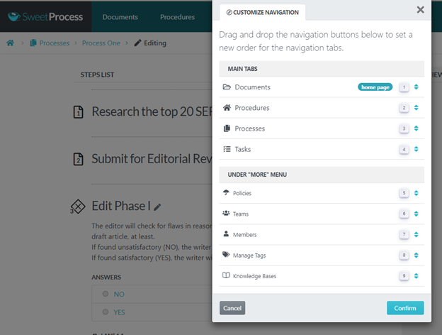
Well, at the moment, it is nested as a sub-menu under the More tab, but it can be wherever you want it to be. Just click on “Customize navigation.”
Which brings you to this:
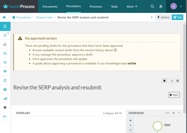
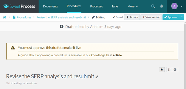
Viewing Version History With Sweetprocess
Remember the procedure we were editing while showing you that you can make it media rich? Well, we added more stuff to it.
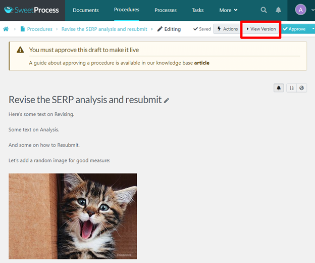
Instead of wondering who might have added that kitty, all you have to do is click on the “View Version” tab on the top right (marked in red).
Then you are shown the document at every stage, including new changes that were made, and by whom and at what time.
You can click the highlight option (top right marked in red) to make it easy to spot what was changed in each version.
There’s also the option to view the most recent draft (exactly below the “More” tab in the main nav, marked in red). This helps you view the present version instantly. Imagine that you have fifty-odd versions in the left panel and you are on the 35th. Without the separate option to view the most recent version, you’d have to scroll up 30+ lines to get to the current version.
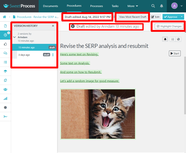
And, of course, just as with any document in SweetProcess, nothing is finalized unless it has admin approval. This little mouser in the picture isn’t going anywhere unless you want it to.
Importing Your Policies and Procedures to SweetProcess
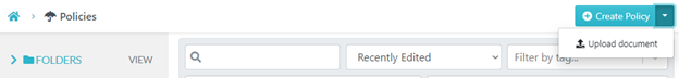
If you want to import a policy which is not already on SweetProcess, under the “Policies” tab click the “Create Policy” button on the top right for the submenu “Upload document,” and that’s it. You will find the same options in the “Procedures” tab as well.
We automatically assign the tab “Imported” to any document you upload like this to make it easy for you to categorize and find later.
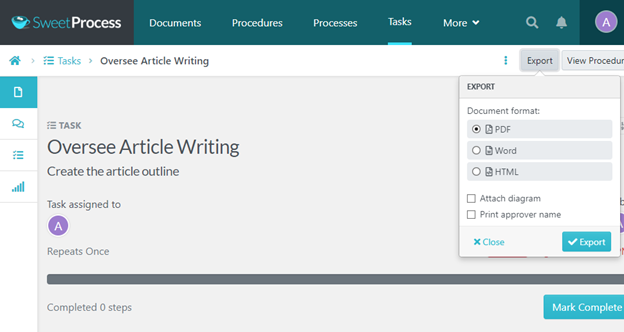
Exporting Your Documents From SweetProcess
When you click on a particular task, you will find the “Export” button top right. Clicking on that will give you the options to export to PDF, Word doc, or HTML.
NOTE: Clicking on the “Tasks” tab will only show you the list of tasks. At that point, the “Export” button will not be visible.
Similarly, no matter which tab you’ve clicked on—” Policy” or “Documents” or whichever—once you click on a particular document/policy/procedure etc, you will notice the “Actions” button on the top right.
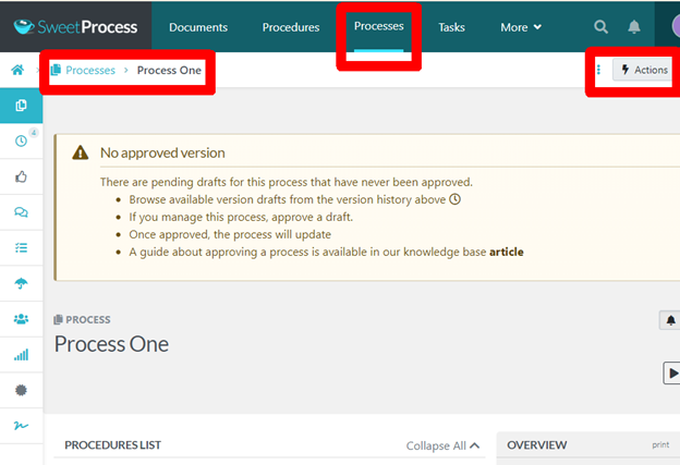
Clicking on the “Actions” button will give you a number of options, including “Export.” By using that option, you will open the submenu shown in the earlier image and choose your export format.
Elementary, right?
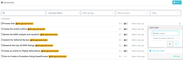
Finding and Organizing Documents with SweetProcess
Everything you’ve created so far is a document by itself. So when you are looking for your stuff, you will find everything under the “Documents” tab, of course! You can organize them into folders by clicking on the three dots to the right of each document and selecting the folder option.
NOTE: “Tasks” are assignments, not documents. They are to be found only under the “Tasks” tab.
The search options will help you add filters and find your target document super quick.
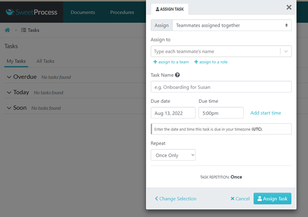
Assigning Tasks with SweetProcess
Okay, let’s go again.
Step 1: Click on the “Tasks” tab.

Step 2: Click on “Assign Task” on the top right and choose your options.
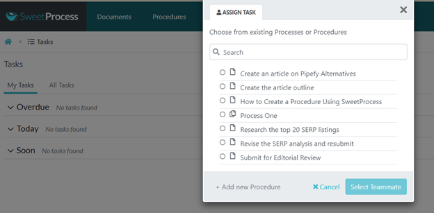
Step 3: Choose the team members, fill in the details, and click on “Assign Task.”
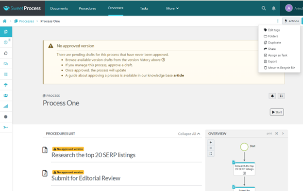
You can assign tasks right from the “Actions” tab (top right) when creating a process. For example:
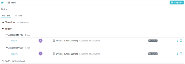
And everything about assigned tasks can be overseen from the “Tasks” tab.
This is so easy that it is getting almost boring. Why not try SweetProcess for 14 days and see for yourself? We don’t even ask for a credit card.
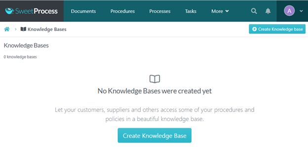
Creating a Knowledge Base With SweetProcess
We strongly believe just the images would have been self-explanatory; still, a few words here and there won’t hurt, so here goes.
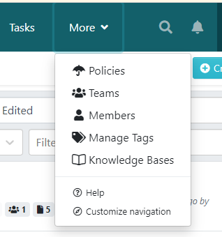
The default location of the “Knowledge Bases” option is in the “More” submenu.
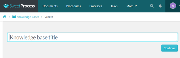
Clicking on that brings you to the following page where you, naturally, click one of the blue buttons, top right or bottom.
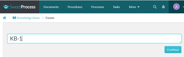
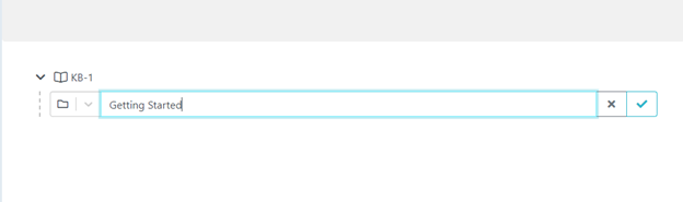
After which you are asked to name your knowledge base.
To confirm the name, click the blue button again.
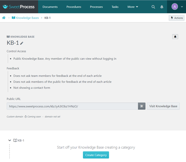
That’s all it takes to create your first knowledge base. Please take note of the privacy options—you decide who gets to view your knowledge base.
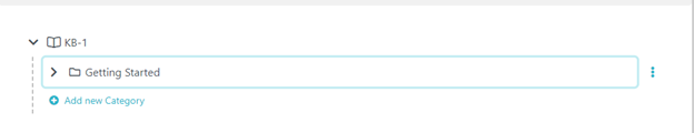
Next, click the blue button at the bottom to create your first category.
Confirm the action with a click to the blue tick.
Now your category has its own folder.
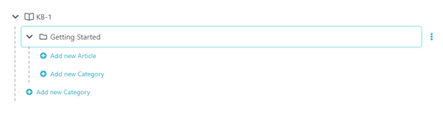
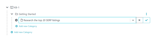
Let’s see what happens when you click on it…
Predictable. It gives you the options to add an article or a new category (which will really be a subcategory).
When you try to add your first article, you will be able to choose from existing procedures and policies. (They will appear as dropdowns when you click the field.)
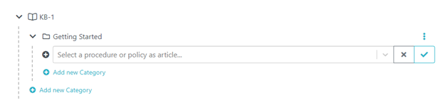
Let’s say you make a choice (and click the blue tick, of course):
And now the article has its own folder, and clicking on the three dots to your right will give you the options to view it in your knowledge base or edit or delete it.
There’s More to SweetProcess Than This
This article about Pipefy alternatives could turn into a SweetProcess guidebook if we tried to tell you everything about SweetProcess. Just give us a try and you’ll be amazed, we promise you.
In case you’re wondering about pricing, you are billed only for people who are actively using SweetProcess. Which means if you have a team of a hundred individuals and only 50 of them are active, you will be billed for 50. If one of them becomes inactive, we’ll make sure your account gets a prorated credit.
About the trial—use all our features for 14 days, no credit card required. Whatever you create during the trial is yours; just export them in your preferred format.
If you buy, you’ll have 30 days to decide if SweetProcess is working for you. If it isn’t, you get a full refund, no questions asked.
2.2 iAuditor

We listed iAuditor because it is an excellent software in its niche. If some of our readers happen to belong in the safety/inspection industry, perhaps they will appreciate something so efficient and specific to their sector.
iAuditor is built for inspection but it can be used to create processes, procedures, and more for any business that needs to keep things streamlined and updated at all times.
By “things” we mean activities conducted to run the business whether by employees or by automated machines running on schedule or through any interaction of the business with external entities (including clients, of course).
What we loved about iAuditor was its clean and lightweight interface and minimalistic approach.
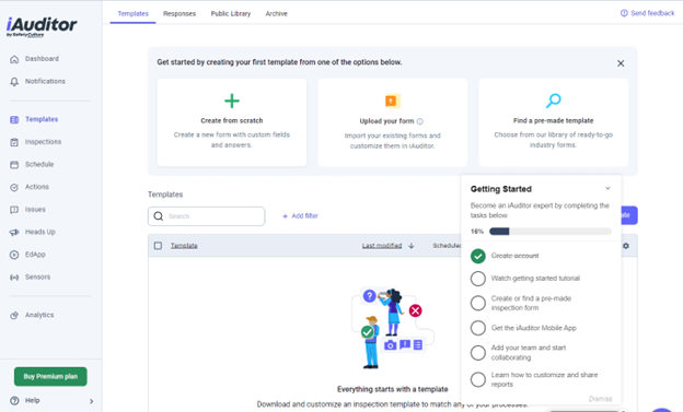
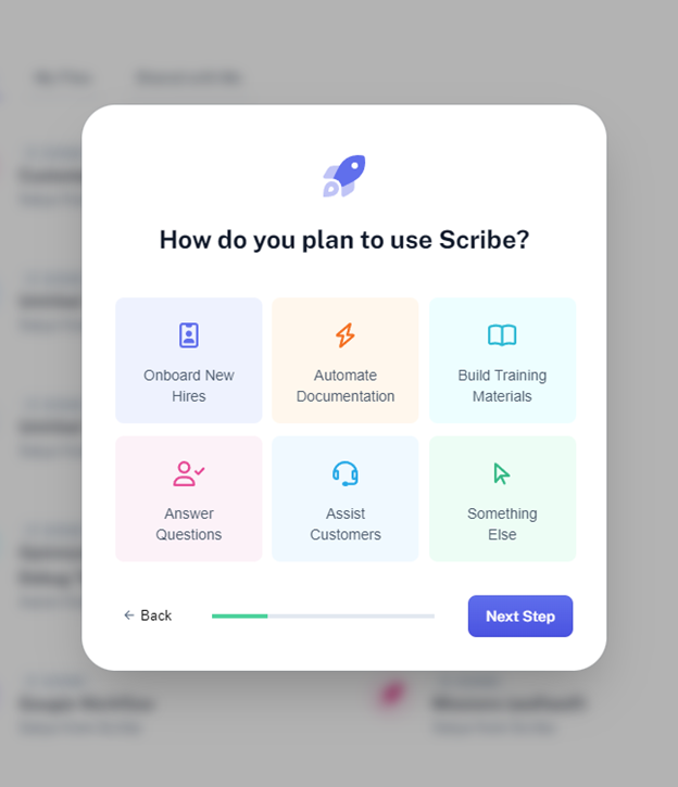
The onboarding process surprised us pleasantly. The no-nonsense approach is apparent when you are not shown the customary login screen post-registration. We were simply transitioned into this screen after a few basic queries to customize our experience.
Even those basic queries didn’t require us to wrack our brains because we could pick the option that said “Just looking around” or something to that effect. In other instances that asked for input, there was always the “Other” option which didn’t have annoying and unending sub-options.
iAuditor was not trying to dig uncomfortably deep and waste our time trying to fit ourselves into prebuilt options or write a short essay explaining why we were there. (The next option we have listed was a very different story.)
When we came to the next screen, there was another pleasant surprise: the mobile view option. Like the SweetProcess overview diagram that updates itself as you create steps in your process or procedure, the mobile view updates itself as you input the necessary details in the main screen.
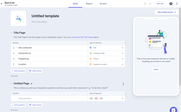
The tabs at the top allow you to build the document, create a report, and determine who can access what.
The options in the template can be dragged, rearranged, changed, or deleted according to your preference. The untitled page (which you will title, of course) is where you mention the actual instructions or steps in the process or procedure and check them off. iAuditor recommends no more than eight questions per page so as not to clutter the view.
So basically, iAuditor thrives on a parent page (Title Page) which describes the particulars of the job and subsequent pages that allows you to list each step and verify whether they were completed. This is best suited for the inspection scenario but can be adapted to create a flow for most other activities that would require moving through several steps.
There’s also a template library if you do not wish to start from scratch.
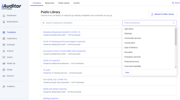
As you can see, you can search for what you need or upload your own template. Again, please note how lightweight the interface is. iAuditor is all about speed and efficiency, even on the move via mobile app, in areas where connectivity may not be perfect.
The left column has options that are self-explanatory and even more so when clicked on. Let’s take a look at “Actions.”
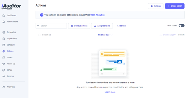
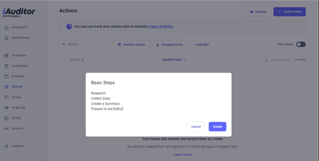
This is for the team to get together and sort things out. Of course, it can be used for any purpose, like a normal meeting or brainstorming. Let’s show you what an “Action” looks like. We clicked on the “Create Action” button at the top right and then populated the Action form that appeared.
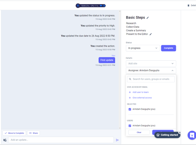
Once it was created, we made certain changes to the default options which all got recorded in what turned out to be a chatbox. Note the “First update” (in the image below) in blue that we sent. Every action taken after the creation of the Action gets recorded for all participants to see. A very transparent and no-frills way for the team to connect.
We have seen colorful instances of pretty much the same method that are dependent on high-speed connection and consume more resources. iAudit didn’t burden our RAM or CPU at all (check the small black bar near the top), and this was while working on an Opera browser with more than thirty active tabs.
It impressed us a great deal. It does what it was designed to do in the most efficient manner possible and without completely sacrificing aesthetics. Dated or not, the interface does provide a pleasant and distraction-free ambience perfect for focusing on work at hand.
2.3. Coassemble

Coassemble’s homepage is a bit unusual —you have to keep switching between horizontal and vertical scrolling. Don’t let that put you off. It has excellent training templates and formatting options. Did we say “training?” Yes, and that’s just Coassemble’s way of describing how you can create an SOP for your employees and make sure they know what’s in it.
This is what we loved the most about Coassemble:

So, with Coassemble, you are not just formulating policies and procedures, but also solving a huge problem that could seriously cost you if you didn’t resolve it—ensuring that your employees actually know about such policies and procedures. You can create groups, or you can train individuals. But this specialized training format certainly beats sending a note to your employees that they have to look up this or that and acknowledge that they have read and understood the content.
Another thing to note about Coassemble is how they are very clear about their target customers.

The home page is aesthetically created and when you sign up, and design-wise, the transition to the inside is seamless—which is very comforting, actually. What they claim on the website (simplicity and so on) is what they offer, as we are about to show you.
They do ask you to make a few choices to streamline your experience but the “Skip” option at the top right made the experience completely bearable.
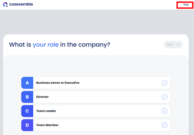
The way they announced the end of that journey was nice too.

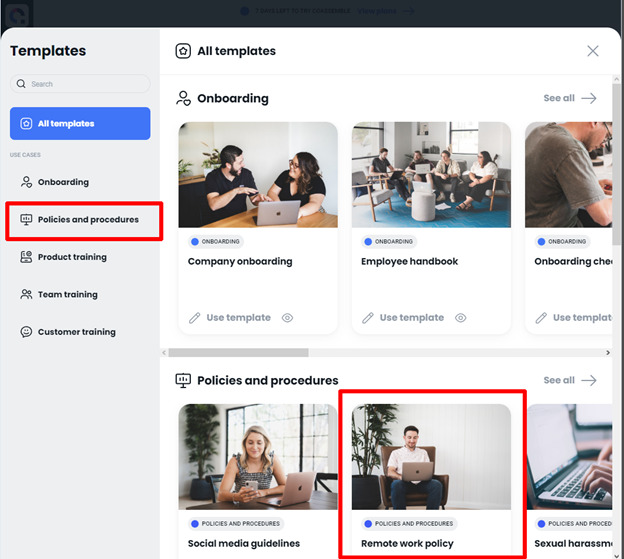
The dashboard was clean and pleasant with just one sample (instead of overcrowding the area for no good reason) and we decided to use a template.
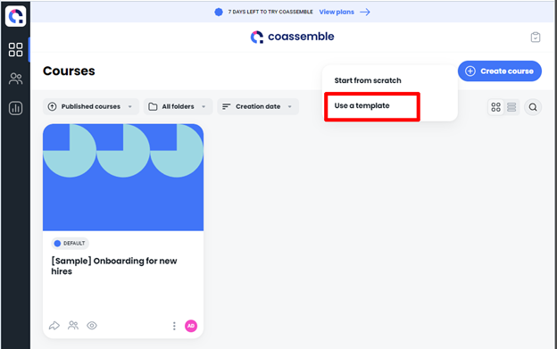
The template gallery was arranged according to category. We chose the one on working remotely from the policies and procedures category.
There was a preview option in the template but we never figured out a way to get out of the preview mode, not even by pressing the Escape key! Getting back to the dashboard and starting afresh (which was not tiresome at all—just two clicks on a fast interface) seemed like the only workaround.
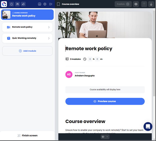
The formatting options were clean enough but with some restrictions. Here’s where you begin:
There’s a bar at the bottom of the editable document with enough formatting options (but not HTML view).
Unfortunately, your formatting options get severely restricted when you click on the headline or the image: all you can do is choose from predetermined placement options. You can change the image, of course, and edit the text. But there’s no way to make the headline look any different in terms of color, size, or font. There’s an option to edit the image…which doesn’t give you any option, strangely.
Here’s what the format options bar looks like (bottom right after a lot of white space in the image below) when you click on the headline:
If you can live with that—and this restriction does ensure a consistent design in the “Training material”—then there are adequate options to get the job done.
You may have noticed the “Finish Screen” option on the bottom left of some of the images. It creates a happy ambience for the learners (your employees) and gives them a sense of achievement. As we mentioned earlier, it was nice to see that they have remained consistent in how they sell themselves and what they actually offer.
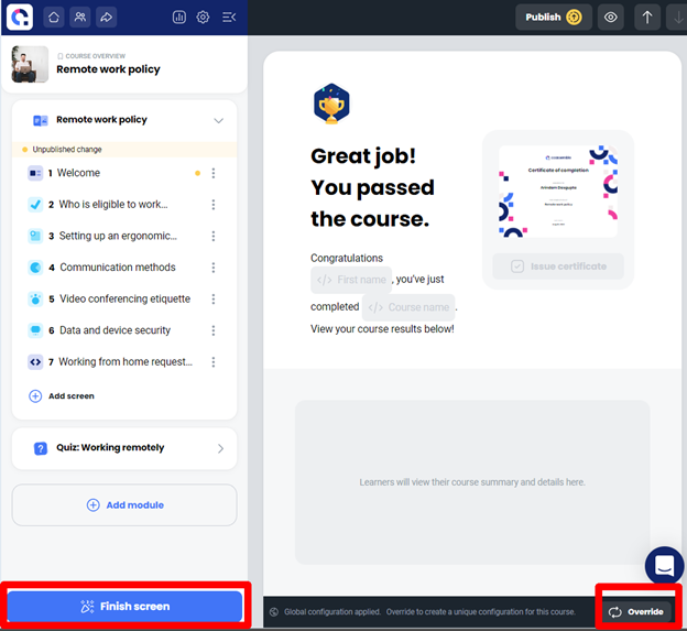
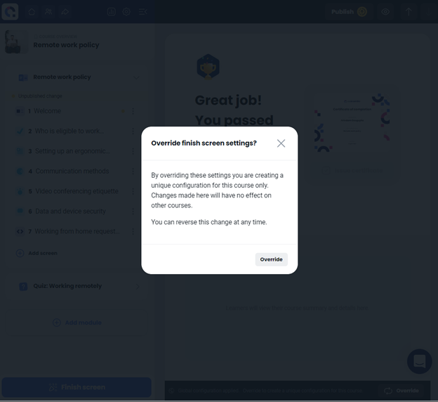
The override button in the image above (bottom right) gives you the option to change the settings of the “Finish screen,” but only for the specific training module.
We found this a sensible way to do things especially if you have multiple instructors (or experts) creating several different modules with complete liberty to design the modules according to the requirements of their audience. This sort of override setting ensures that no one encroaches upon anyone else’s course design.
So that’s more or less it. We were happy with the way things functioned. If you are among Coassemble’s target customer segment (first-time users) then this is a good way to get your feet wet. If you are an already thriving business with a software you are comfortable with, you might want to consider adding Coassemble to your repertoire just for the training-specific aspects.
As a Pipefy alternative, Coassemble may seem limited, but the way we see it is: simplicity and an almost non-existent learning curve is better than being given a whole lot of options and not knowing what to do with them.
Besides, the “limited” part of Coassemble, if we’re being honest, is not really a limitation. They help you create policies and procedures for your business and have a perfectly integrated method of getting those across to your employees without making them feel overwhelmed. Coassemble does not, for example, claim to be an accounting, communications, and record keeping software in addition to what it is good for. If you choose Coassemble for what it does offer, you will not be disappointed.
2.4. Process Bliss

Process Bliss is like a lite version of SweetProcess in some ways. We’ll show you how in a moment. But first, about the onboarding process: not overly tedious, but we didn’t see why the usual queries could not be skipped altogether.
We were taken to the “Tasks” window first. From there, we clicked on “Dashboard” and this is what we saw:
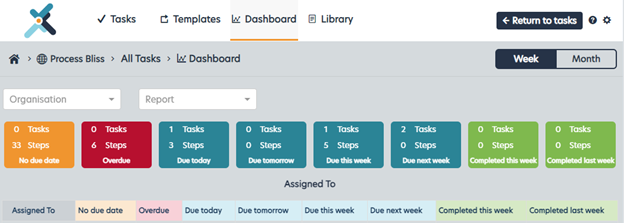
Aesthetics are subjective, for the most part, but we couldn’t help but notice how unusual the font was.
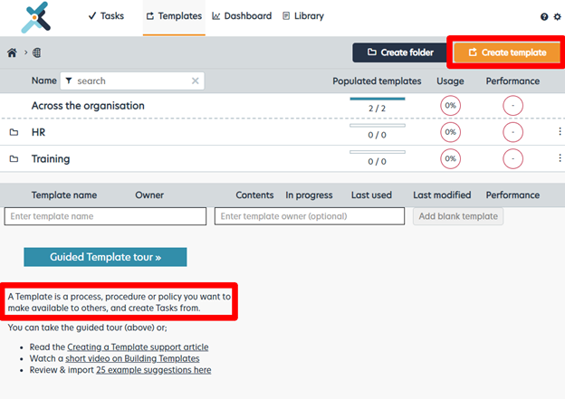
The navigation menu does not show Process/Procedure/Document like SweetProcess does because for everything, Process Bliss uses the generic term: “Template.”
We tried creating a template and noticed they have something that we thought would be an overview that updates itself in real time like ours does (we were wrong), and the familiar “Steps” and “Decision” options.
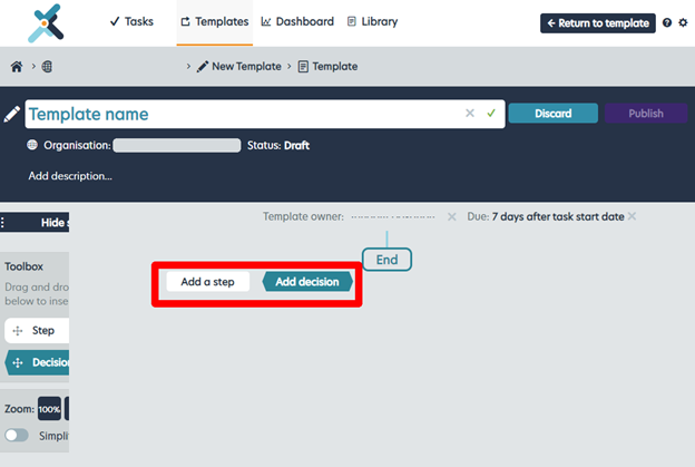
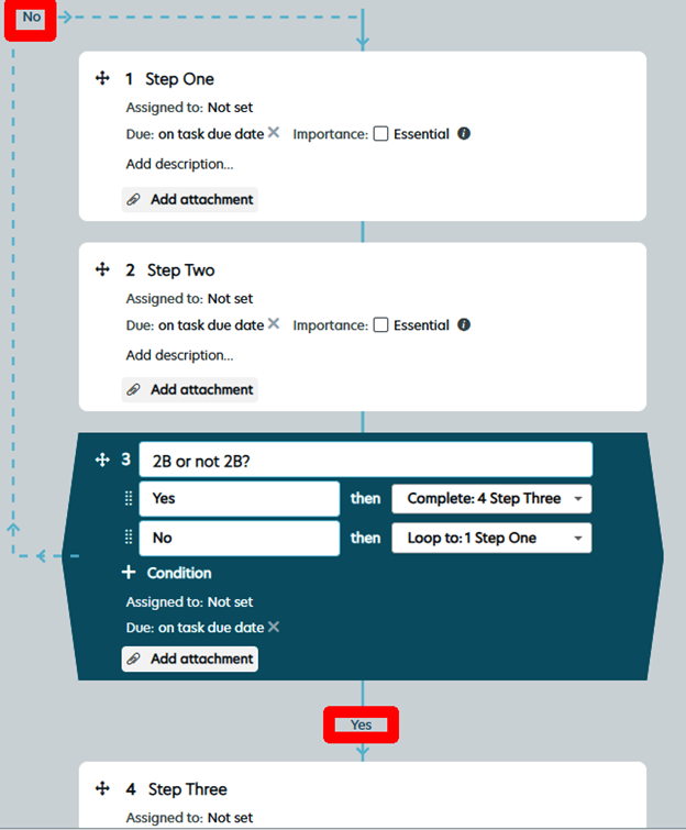
We created a few dummy steps and added a decision.
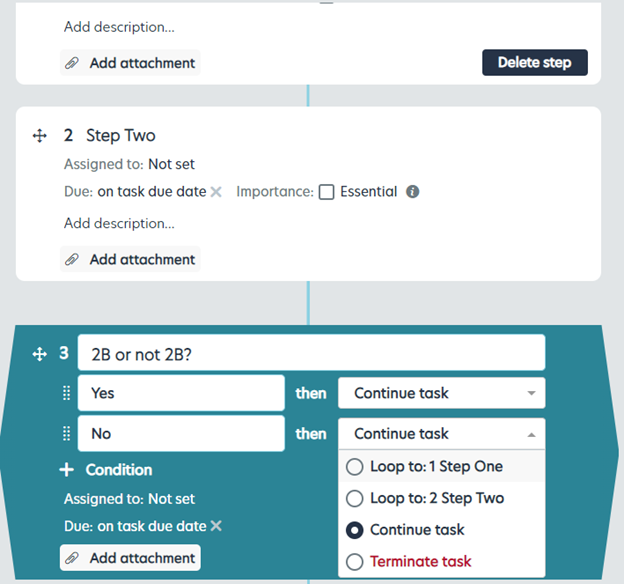
This is how it looked after we chose the option “Loop to:1 Step One” for “No.”
As for what we thought would be something similar to our overview, that turned out to be a toolbox to add new steps and decisions in between steps and decisions.
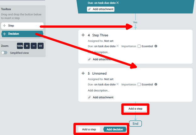
The toolbox is necessary because Process Bliss does not have the option to add a new step or decision after every single step or decision that you create. To refresh your memory, here’s how it looks on SweetProcess:
Like we said, a lite version of SweetProcess. Less intuitive, less user-friendly, but then, we are listing this as a Pipefy alternative. If you didn’t know about SweetProcess, Process Bliss would probably be a pretty blissful experience after the complexities of Pipefy.
You can add a video, image, assign tasks—do everything that is required. There’s nothing intrinsically wrong with Process Bliss. We may appear a little snobbish because of how much more SweetProcess has to offer along similar lines, but that’s all there is to it. Overall, Process Bliss is a good choice if you’re looking for a Pipefy alternative, especially with regard to creating procedures and policies.
2.5. Scribe

This was so different from the rest that we couldn’t help but include it in this list. Let’s just move into it—this will not take long.
This is the usual dialogue box to customize user-experience. After that we had to install the Scribe extension for Chrome. We were using Opera but the extension fit in seamlessly. You should probably use a Chromium-based browser if you choose to work with Scribe.
This is what you see when you log in and try to get some work done. The blue button on the top right gives you the option to create either a new “Scribe” or a new “Page.” We didn’t get very far with the new Scribe option and chose Page after that.
We were trying to figure things out on our own to see how intuitive the software was, but we did have to consult the knowledge base from time to time. They seem to prefer videos which are pretty well-made.

This is your Page. You get to edit it as the Scribe app is recording what you do. Please bear with us if you’re feeling a little lost. We were, too, but figured things out eventually.
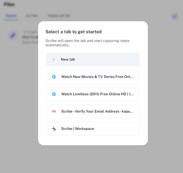
We had to select which tab to record. We chose the Scribe Workspace.
The recorder by default sits at the bottom left of your work area (you get to choose the work area—we’ll show you how) and looks like this when it is recording:

The next image is from the screenshots the recorder took while we worked on the page, playing around with the formatting and so on.
It seems to record screenshots as well as our mouse and keyboard actions in text format—though not too accurately. For example, in the second image within the image below (numbered 15), the text recording says “Click” (the sentence we typed in). If the recording was accurate, it would have stated “Click and select” because that’s what we did.
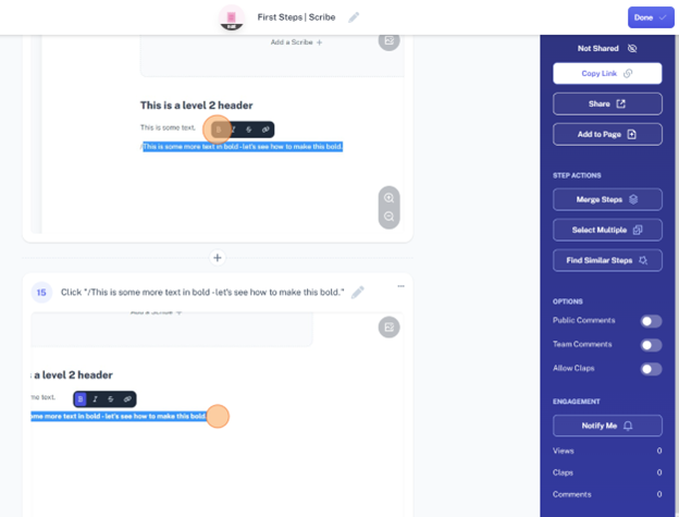
As you can see in the same image (number 15), the screenshot is not centered. This was the case with many of the 39 screenshots the recorder had captured. All we did was create a title, add a bit of text and format two lines of the text, and then add a link.
You can now edit all of these steps to create a Scribe which can be a procedure or process document. There are lots of options but let’s not even go into that.
What we are thinking is, how does this benefit us? How does this save time? And the recorder isn’t even doing its job right.
Obviously, Scribe is not for everyone. We could think of two ways to make the best use of it.
- Use it in conjunction with your primary SOP software. It will not miss a single step and you will get everything which you can then ruthlessly edit and export and share in different formats.
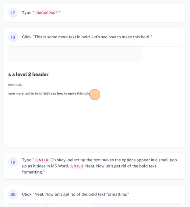
- Use it as your primary software if you are ready with a script every time you’re trying to create a process or procedure. Otherwise, you will get a lot of recordings that say “Backspace.” Here’s a section of the total recording that should give you a clearer idea of how literal things can get:
Basically, whatever you are doing becomes the “How to.” Whether the final product is useful or confusing will depend upon how well you planned and prepared for it and how good your editing skills are.
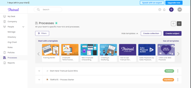
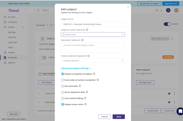
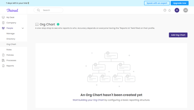
2.6. Trainual

To be honest, by the time we were done creating a process with Trainual, we were so impressed that we could not immediately find the platform lacking in anything. It was after the initial euphoria was over that we realized what was missing—but more on that later. Right now, let’s show you the good part.
This is the welcome screen when you ask for a trial:
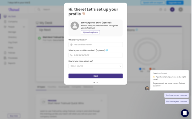
After filling in a few more details in the next screen, we were in.
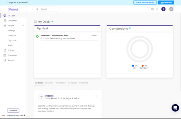
As you can see, the “My Desk” view is an overview of all that is going on. The question mark icon enclosed in a circle beside the bell icon (top right) is the link to the knowledge base. You have everything else you may need on a day-to-day basis on the left panel.
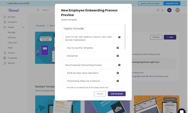
We decided to create a process. And we chose a template for that purpose just to see how good it was. Pretty good, we have to say.
We do wish the preview panel were not so small—didn’t see any point to making it small, but okay.
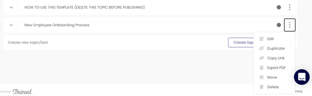
The image below shows where you begin editing the document. There’s the export and other options if you click on the three dots to the right end of the line where the template name shows. There’s absolutely nothing wrong with how it looks—after all, you have to populate everything.
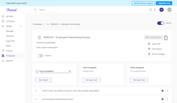
Still, we found the bare-bones look kind of distressing after having viewed the superior aesthetics on the home page.
It felt almost like when you install a new WordPress theme after watching its demo and find that it is looking like…well, not looking anything like the demo.
Not a deal breaker. We just wish they had added a bit more color instead of giving us a washed-out look. Might have added a bit of zest to a new worker’s first attempt is all we’re saying.
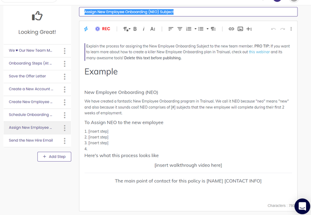
We found that you have to make the subject (document title) and the content fields editable separately. No problem there.
When looking for options, locate the three dots to the right of wherever you are and click them. Then you’ll see your options (bottom right in the screenshot below).
These guys have a sense of humor judging by how they created the template. That’s always a plus. No point in going all doom and gloom and formal when nice and easy gets the job done just as well, and maybe even better.
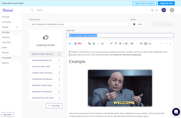
We liked how they’ve been methodical in their approach while creating the template.
Next, we snooped around a bit and everything looked peachy. We loved the “People” section even though the washed-out look did persist.
We took solace in knowing how it would look once we did our part of the job.
Trainual actually seemed perfect—until we looked for a few extra features that everyone at SweetProcess takes for granted.
To begin with, there was no version history option. You cannot go back and find out who did what and rectify it.
We tested the search function by inserting something admittedly absurd into the process document and then searching for it. The result was satisfactory (unlike how Pipefy fared, if you remember).
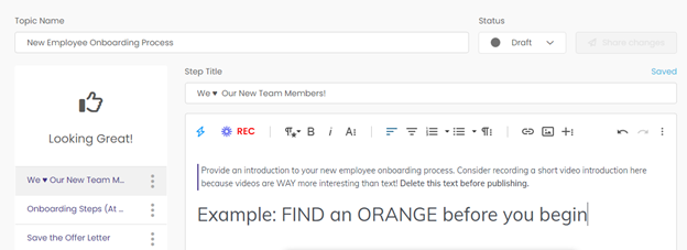
Trainual found the orange for us.
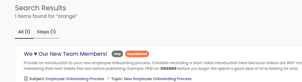
However, ours was a very limited test. Users have actually complained about the search function.
And then we found something that did indeed escape our notice at first but honestly cannot be something any business can afford to do without:
It does appear Trainual is lacking in the record-keeping department—no version history, no real-time data, no way to sort through the activities to get an idea of what has been going on, what may be prioritized, and if there’s scope of improvement somewhere. This is a very essential, dynamic aspect and its absence is like trying to run a web-based business with zero or minimal access to Google Analytics or something similar.
In spite of the cons, we still recommend Trainual as a Pipefy alternative because the interface is fast and makes work effortless and intuitive.
2.7. Way We Do

We loved the interface, and hated the onboarding process. You are given a subdomain which you can name. But this was the fourth screen we encountered and there didn’t seem to be any way to opt out of the process and getting straight to the dashboard.
There were four more screens to get past.
The worst part was that when we did get to the dashboard and the related pages, we didn’t see anything that would justify the long and tiring onboarding process.
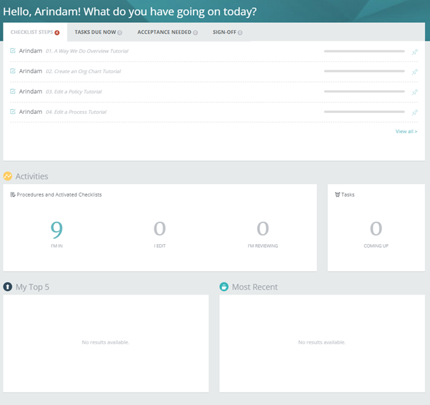
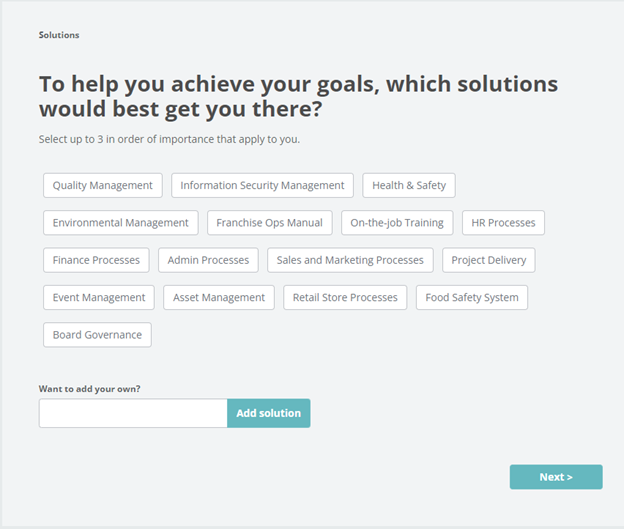
We clicked the hyperlinked “9” in the Activities section and were brought to some training materials/templates which had, among others, the options we had expressed interest in while getting past those annyong screens. But seriously, we could have picked those from a template library on our own.
Anyway, this is what we saw and then, without reading the fine print, clicked on the one about new employee onboarding.
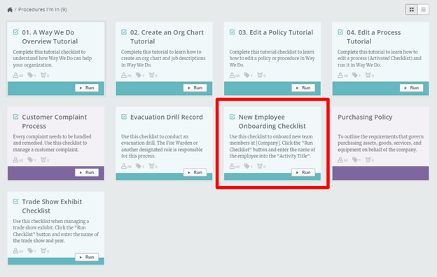
Which brought us here:
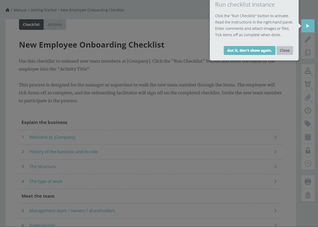
After “running” the checklist instance (which is a pretty fancy way to say making the document editable), this is what we found. We typed in a name (“Check Bio Data”) in the Activity title field. It was just a random name, but wait for why we are harping on this so much.
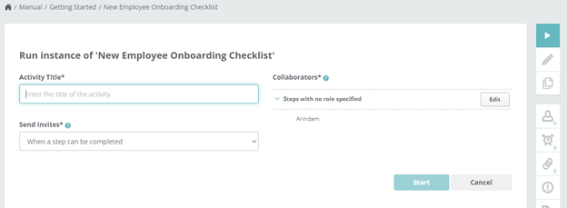
In the next screen, we found a pre-formatted document with the title we had inserted. It didn’t make sense, because our title for the so-called “activity” seemed quite redundant. The content would have been the same even if we had typed in something ridiculous like “Go swimming together.”
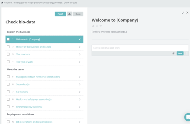
We clicked on “Finish” after that to see what would happen, and what happened was kind of alarming.
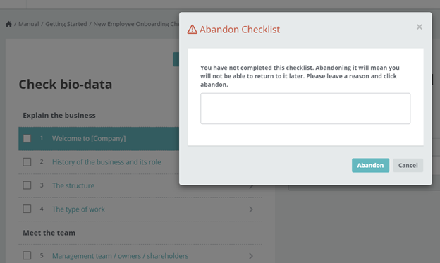
Language is a mode of communication, after all, and shows your intent. Inserting irrevocable conditions for no apparent reason and stating the same as some kind of ultimatum further exposes your intent. We’re not judging and nor are we being extra sensitive, but we’ve never seen anything like this before. And frankly, it wasn’t something we’d look forward to either at work or while using a software which is supposed to help us get our work done.
We clicked “Cancel” on the scary pop-up and “closed” the document instead of “finishing” it. Then we went back and found it sitting cozy with a resume button—which was great.
But then we clicked around a bit more and came upon the templates page again and this time, we did read the small print we had missed earlier.
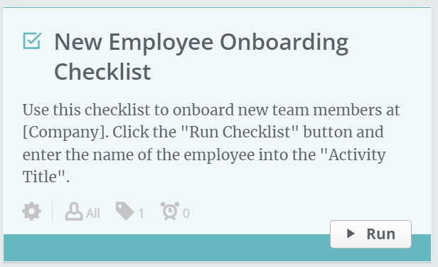
We were supposed to enter the name of “the employee” into the “Activity Title”? Our first reaction to this was that we must have missed something. But no, we hadn’t.
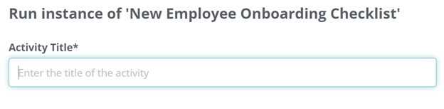
“Enter the title of the activity,” it clearly says. As it should.
So why are we cribbing over what must have obviously been a typo (name of the employee instead of name of the activity)?
Well, because of the following reasons:
- A high-handed pop-up can be tolerated as indicative of extremely regimented work culture—but that kind of work culture should know better than to allow typos in the training material for new clients.
- Clicking “Finish” does not have to imply you are “abandoning” a document just because you haven’t filled it in completely. In fact, the Finish option itself is quite redundant since any document may be closed (and auto-saved) and “resumed” whenever there is something useful to be added or some edits to be made. All you need is an authority that would “approve” of the edits each time—like we have in SweetProcess.
- The material itself is preformatted but still includes a redundant step of naming an activity which makes the naming ritual totally irrelevant. It wouldn’t be irrelevant or redundant if the field already contained an appropriate name which we could edit.
- This penchant for redundancy was displayed earlier when we had to make multiple choices and answer questions while getting past the first eight client onboarding screens.
- The limited or, shall we say, restricted formatting options (coming up next) do not in any manner help make up for these annoyances which could have been dismissed as otherwise “minor.”
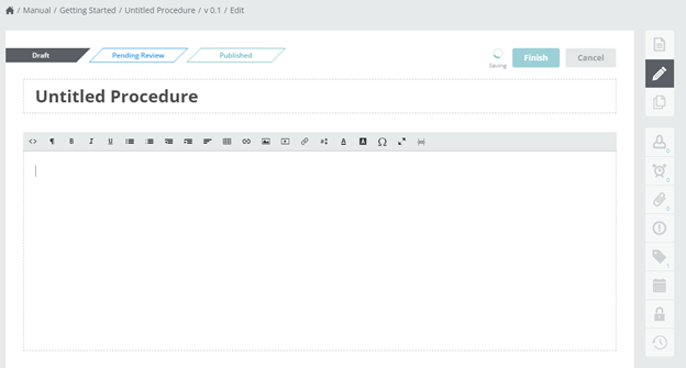
This is what we found when we started with a blank template, and it looked good at first:
Even though the Way We Do site is built with WordPress, the subdomains are not. They seem to be created via Azure and at least the formatting options leave much to be desired when compared with WordPress.
Please take a look at the following screenshot taken after we were done testing the interface, and we’ll explain what we found.
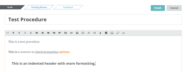
To the extreme left of the formatting options bar you will find the <> icon that leads you into the HTML view.
If you wish to format any header, you will have to go into the code view. We simply could not make any part of the header look any different from how it had been preformatted, by selecting the text and clicking the options bar items.
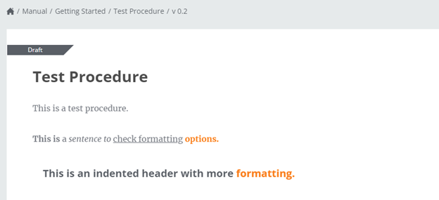
Thankfully, modifying the code did work.
But while we were at it, our predominant thoughts were of redundancy and restrictiveness. We could try again some other day when the weather’s not damp and rainy, but that seriously may not make a significant difference to our perception.
If Way We Do were the only software of its kind, out of necessity we’d ignore these and just get on with our work—which is how most of us are forced to deal with life in general. However, this is a review through first-hand experience for our readers, and we thought we’d just leave it out here, in the raw, so that you can decide for yourself.
So Does This Mean WWD Fails as a Pipefy Alternative?
If that were the case, we wouldn’t list it here. WWD has something that we, at SweetProcess, are proud to advertise as one of our strongest points: version history.
If you can get past what we found annoying—and use the considerable resources that WWD offers while ignoring the limitations in formatting—then you might actually find it useful, especially when the version history makes sure that nothing is ever truly lost.
Oh, wait—that ominous pop-up did warn against “abandoning” a document (when you are really only clicking on “Finish”). So that might be an exception where no record is stored.
- You may want to compare other Pipefy alternatives. Check out this in-depth guide we wrote on Pipefy Vs Kissflow
Chapter 3: Summing It Up: Have You Decided on Your Pipefy Alternative Yet?

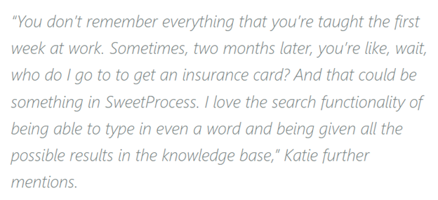
Hopefully, you’re clearer now about what will serve you best as a Pipefy alternative. Even if SweetProcess didn’t make it to the top of your list, we urge you to give us a try. We have been streamlining SweetProcess through the years based on user feedback like this:
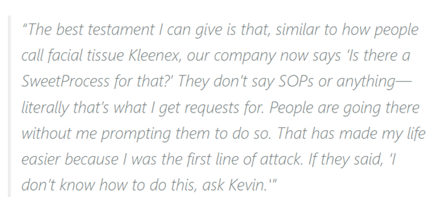
Remember how we griped about Pipefy’s search functionality? See for yourself what this SweetProcess client has to say about our search function:
Try us, and maybe you’ll stay with us. Because we are not just about getting work done: SweetProcess is about getting work done together. Not every software is designed with team spirit and workplace harmony in mind. Ours is. And it is heartening to see how much our clients appreciate that.
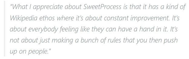
That’d be Sarah Genay, Portfolio Analytics Manager at Gingko Residential, talking about how SweetProcess made a difference with their business process documentation—and more, as you can obviously tell from what she says.
You can read more about real people with real businesses gushing about what SweetProcess did for them, but at this point we sincerely believe you need to see if it isn’t what you’ve always been looking for. You’ll get a full-feature, 14-day trial, no credit card required. What have you got to lose?
But wait, there’s more.
We offer a full 30-day money-back guarantee once you purchase, no questions asked. If you don’t like us, we don’t want your money.
In fact, just so you don’t feel bad about having spent a month on us, we offer a free one-hour consultation on whichever aspect of your business you think you need help with. This allows us to make ourselves better and, hopefully, creates a good memory for you even when you feel we’re not a good fit for your requirements.
Fair enough? Go ahead and get your free trial now.